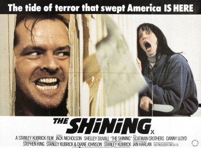
The first poster I'll be looking at is the well known poster from "The Shining" one of my favorite films. The film is ultimately a psychological horror, but does contain elements of thrillers, and more specifically psychological thrillers. I'm looking at this poster to give me a better understanding of how genre is indicated through posters.
Obvious indicators here well be the props in the poster, such as the use of the axe breaking through the door, and the knife in the distressed woman's hand. Indicate danger used in horrors. However also the pictures used in the poster our all from the film itself, and the audience will notice this after seeing the film. The axe breaking through the door can reflect the films plot and themes, as jack goes from sanity to insanity, as if breaking into insanity and madness. The poster also uses the rule of thirds and is clearly split into 3 parts.
 The second poster I'll look at is that of "The Poltergeist" which we looked at in class, from my suggestion. As it is a poster that I can seem to remember rather well. It is another horror, however there are various meaning behind the poster, and I need to understand what makes it a good poster.
 This version of the poster is blue in colour, but there is also a black and white version which is also commonly used. The blue here gives an eerie feel to the poster, it also links with supernatural forces in the film. The focus of the poster is the little girl in the middle with her hands on the static of the TV. There is something unsettling about this, and create a sense of mystery. What probably makes this a good poster is the difference between the sinister supernatural theme and the innocent looking young girl, this is reinforced by the teddy on the floor. It creates questions such as: Is she looking in the TV? What link is there between her and the TV? and various other things. Similarly to "The Shining" this image also appears in the film itself.
 The third poster all be looking at is the poster form "Sin City" which is a film which links strongly to our own film. It is a crime thriller film. which if primarily in black and white, but does also include red. This same idea we plan to use in our own film to exaggerate blood and characters clothing.
 In the poster you can see some of the characters in the film in various action poses. Also the guns are featured in the poster linking to thriller and action. Also due to the colouring the poster is dark and moody, which is a usual theme in thriller films. Red is used for the title to reflect the films colouring and the graphic novel on what it's based on. The titles also have a comic book look again reflecting the graphic novel. Rain is also feature again making it appear darker.
No comments:
Post a Comment